


Sudu.Ai Project
Make Life Easier with

Mobile Version
Role
User Researcher
UI Designer
Product Designer
Interaction Designer
Collabration
Product Manager
Product Owner
Business Analyst
Developer/AI Engineer
Marketer/Graphic
designer
Tools
Figma
Illsutrator
Photoshop
Adobe XD
Ai
Duration
Start : Nov 2023 - Current
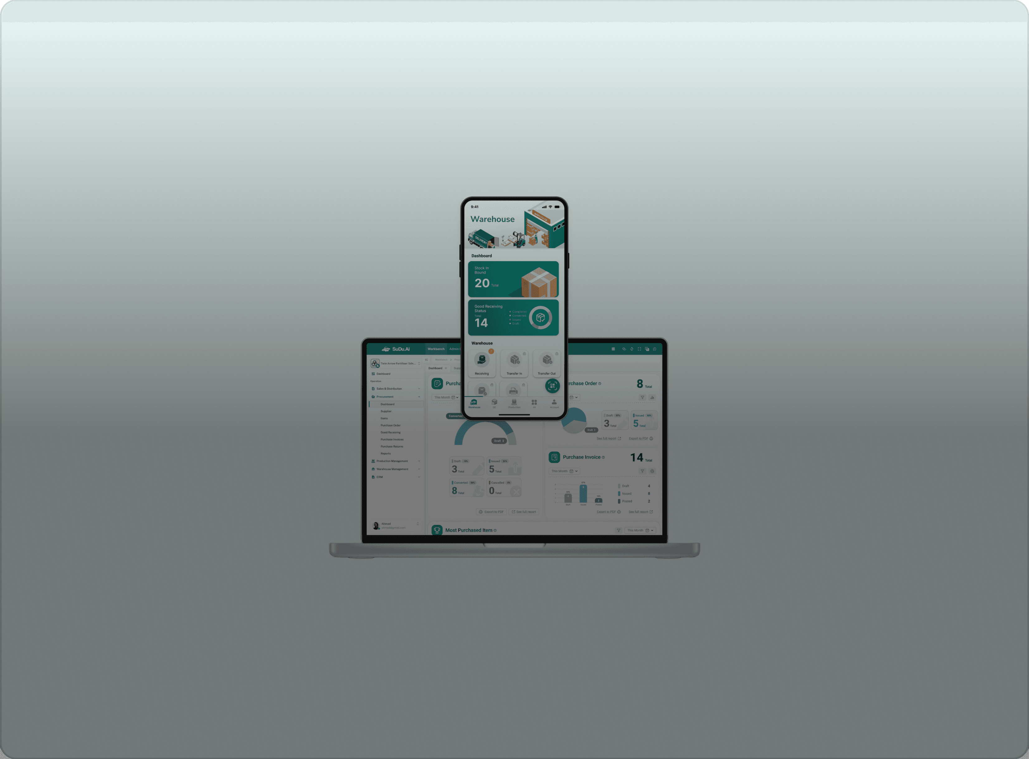
This project focuses on the mobile version of our ERP system, building base on the web platform developed in the first phase. While the web version laid the foundation for usability and structure, the mobile version explores AI-powered features to enhance productivity on the go.
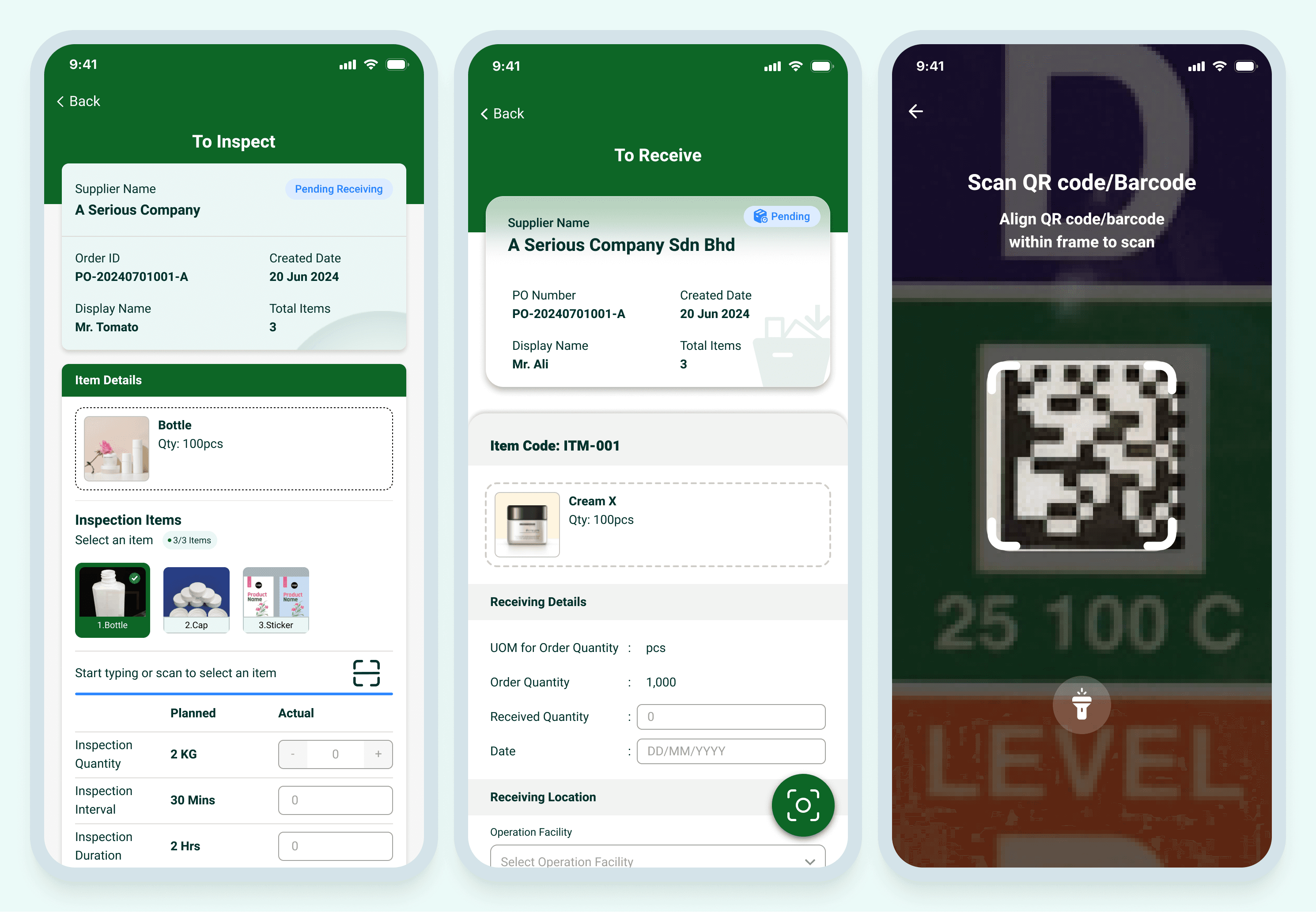
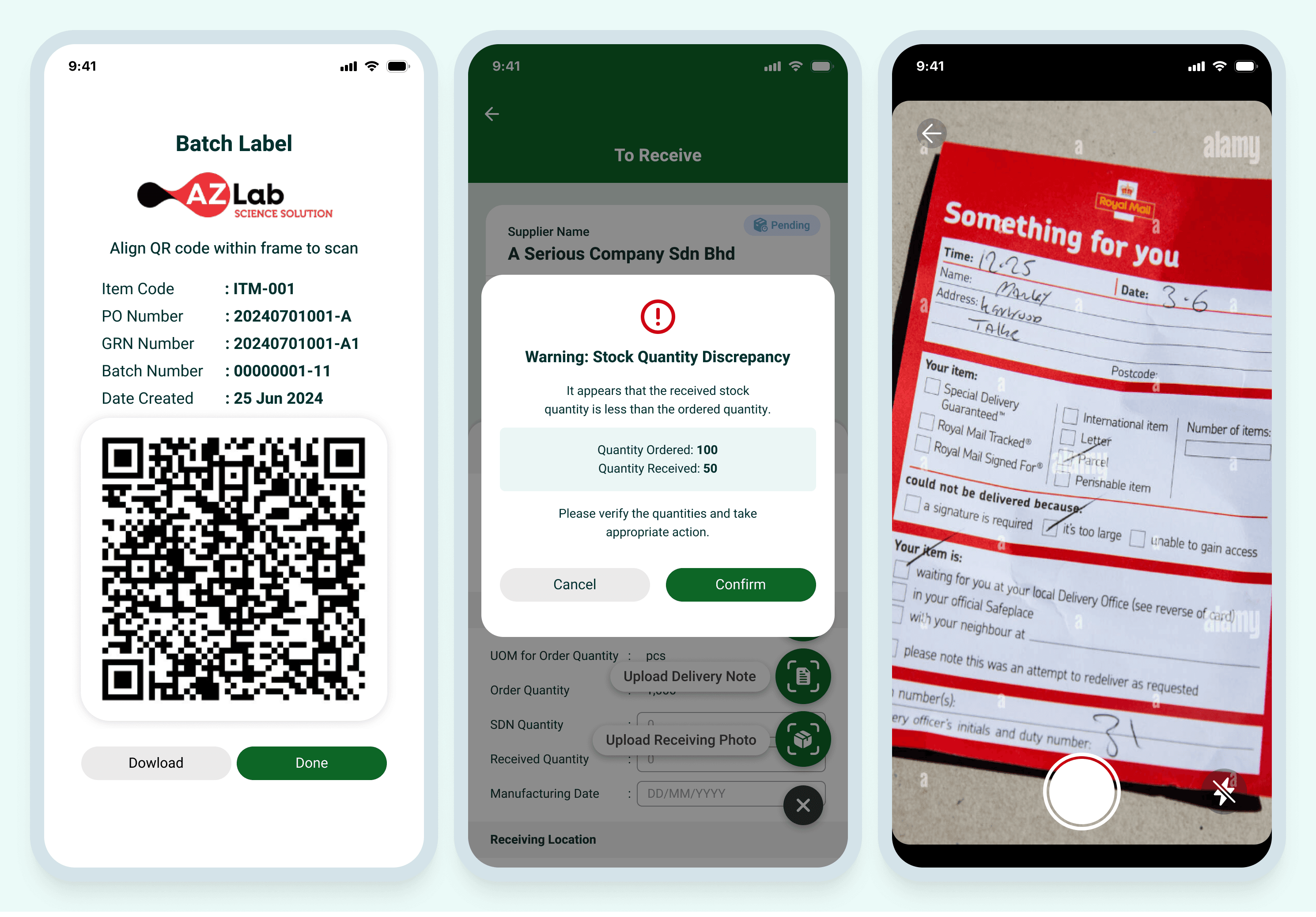
Key innovations include a Smart Scan feature that uses the camera to capture and process documents, receipts, and inventory labels in real-time—reducing manual input and improving data accuracy.
By combining intelligent features with thoughtful UI design, this mobile ERP system empowers users to work smarter—anytime, anywhere.


Working on the mobile ERP system was a journey full of iteration, collaboration, and discovery. The app needed to serve users from various departments like production, quality control, and warehouse management — all with different workflows, on small screens, in fast-paced environments. Here's how we evolved the design across versions.


In the first version, our focus was clear: get the core user flow right.
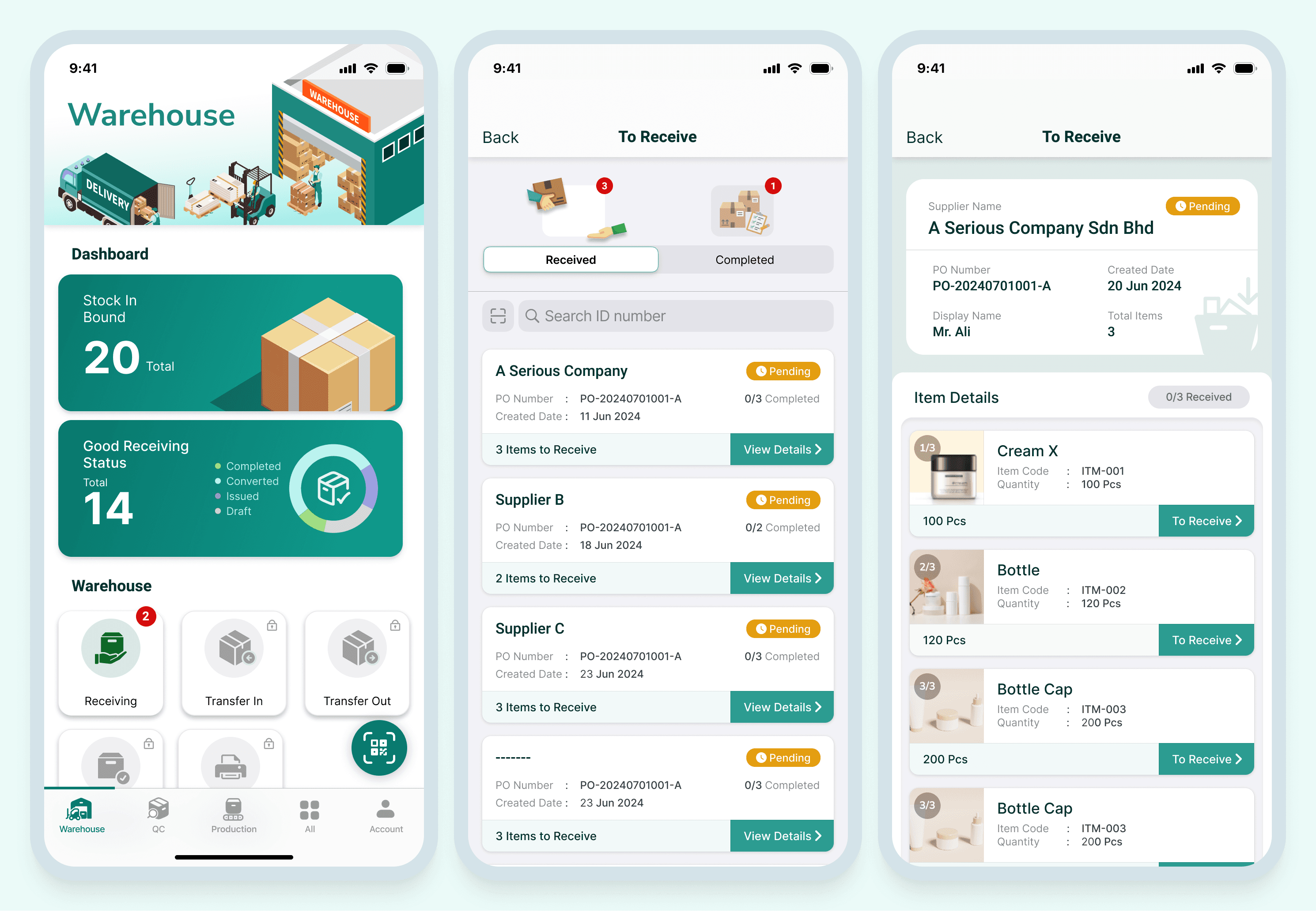
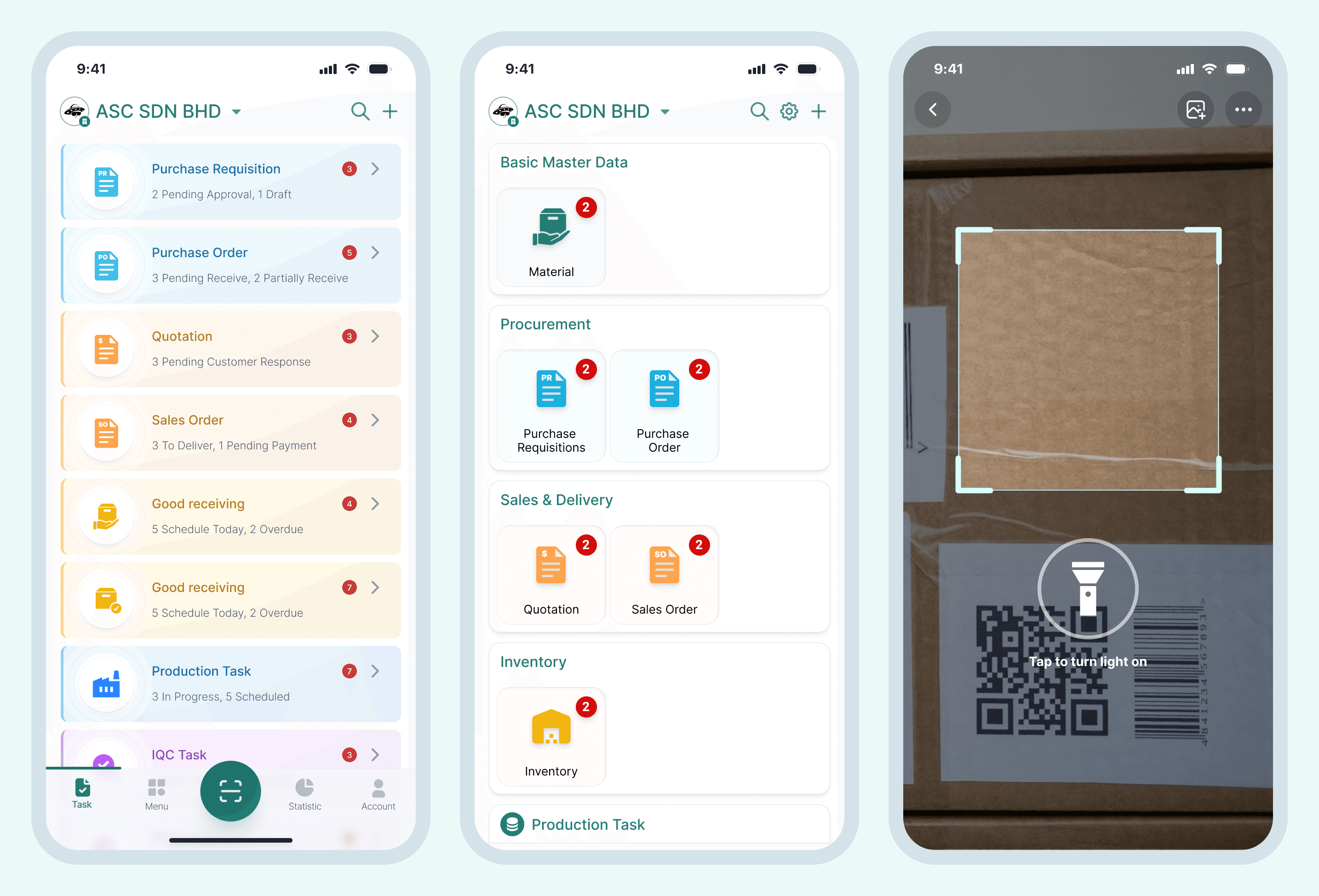
I worked closely with the product owner, business analyst, and engineers to map out essential features like Warehouse, Quality Control, Production, and Scan. Our goal was to ensure users could perform their key tasks with as few taps as possible — think of it like designing a toolbox, not polished yet, but everything had to be in the right place.
We did deep user flow research, comparing ERP app behaviors across industries, analyzing warehouse staff routines, and reviewing QC reporting tools. However, because we were prioritizing function over form, the visual design lacked consistency. We didn’t use a proper design system, which led to mismatched colors, irregular spacings, and inconsistent button styles.

With a working structure in place, we began polishing the experience. This phase was about usability and user comfort.
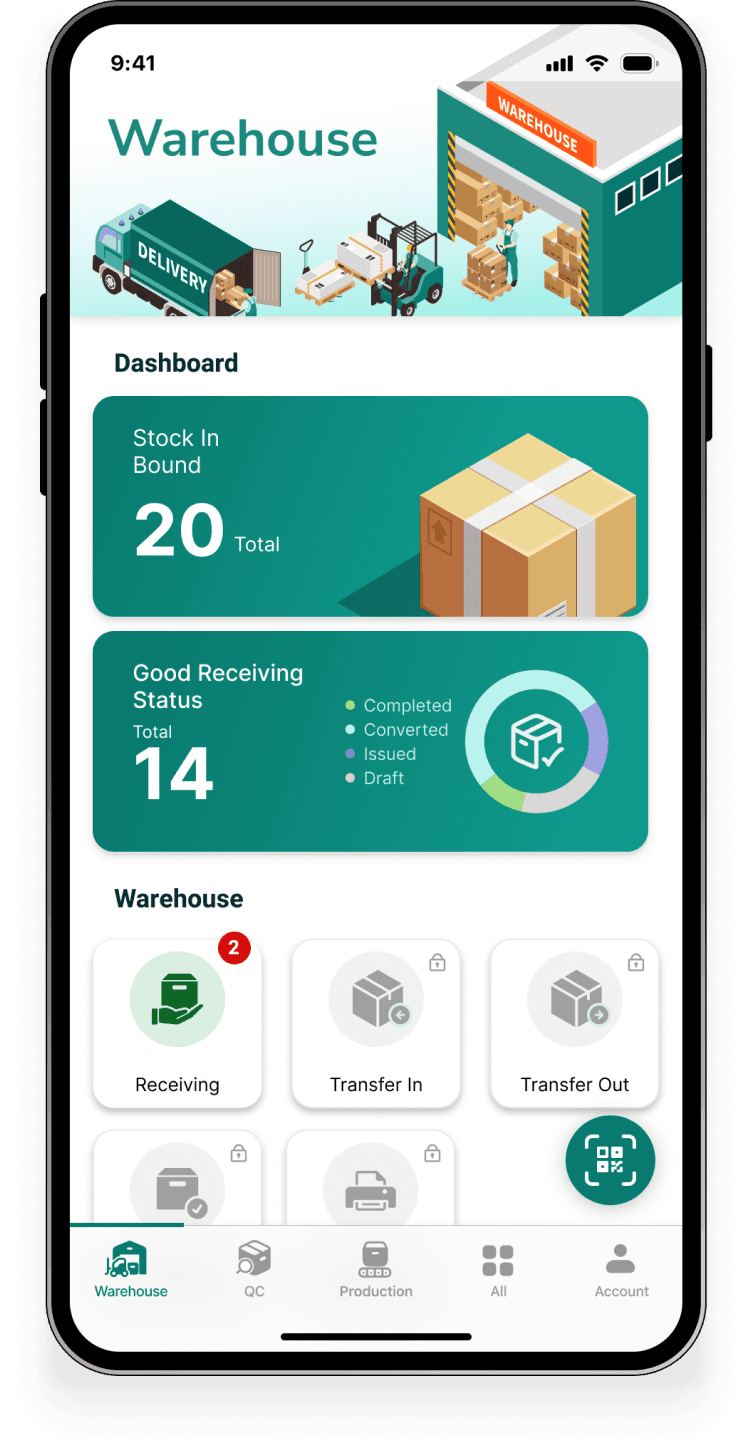
We introduced a new tab in the main navigation — “All”, to show all available features and actions at a glance. This helped users quickly access less frequently used functions without cluttering the core flow.
We also added a floating “Scan” button, a practical shortcut for the feature users accessed most on the go — like a remote control button you can hit from anywhere in the app. It boosted efficiency and felt more natural on mobile.
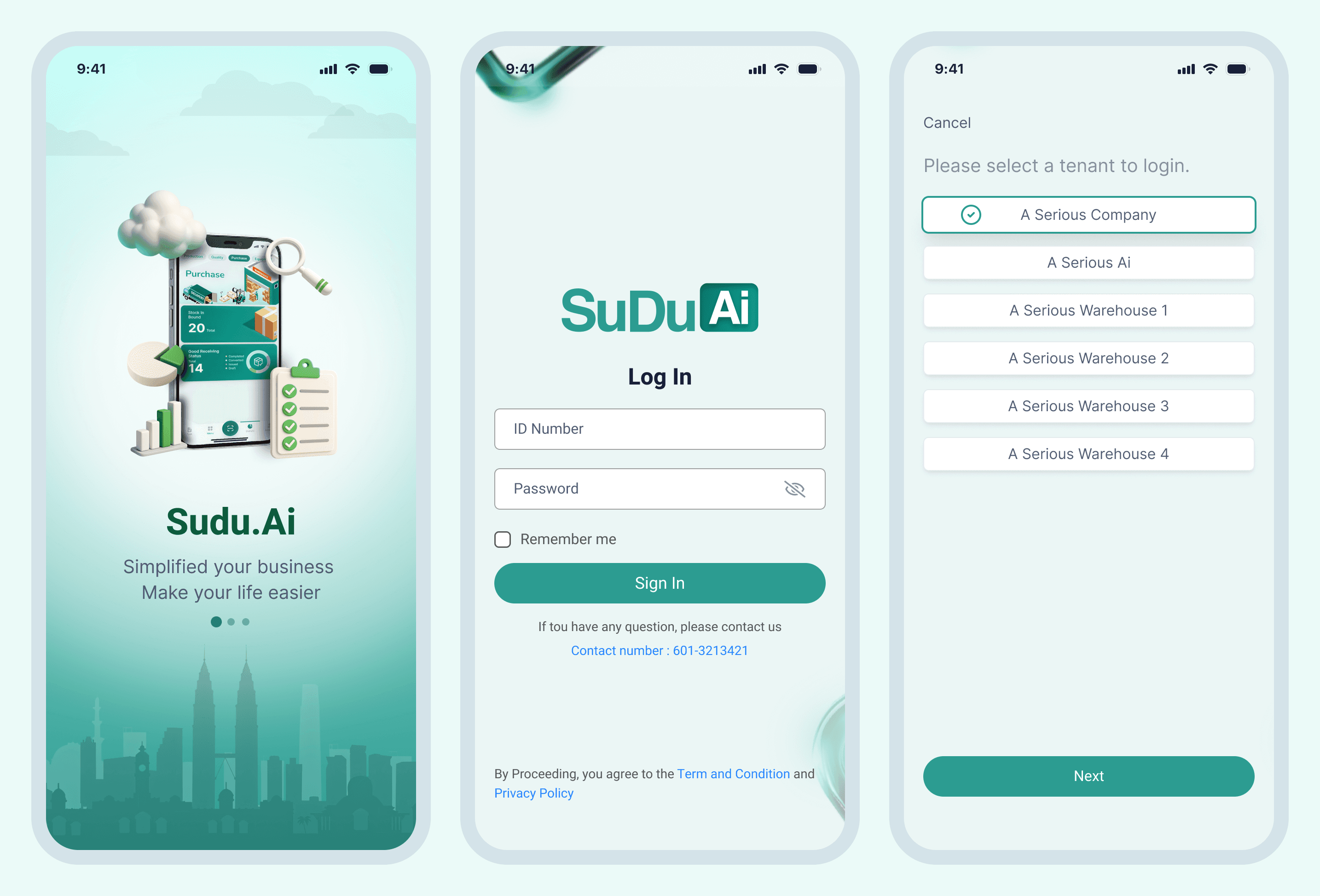
Visually, we shifted from a dark, heavy green to a lighter green palette, making the UI feel fresher and more modern. We added introductory illustrations and improved icon clarity, helping first-time users feel less overwhelmed. The overall UI became friendlier and less intimidating, but we knew there was still work to do.


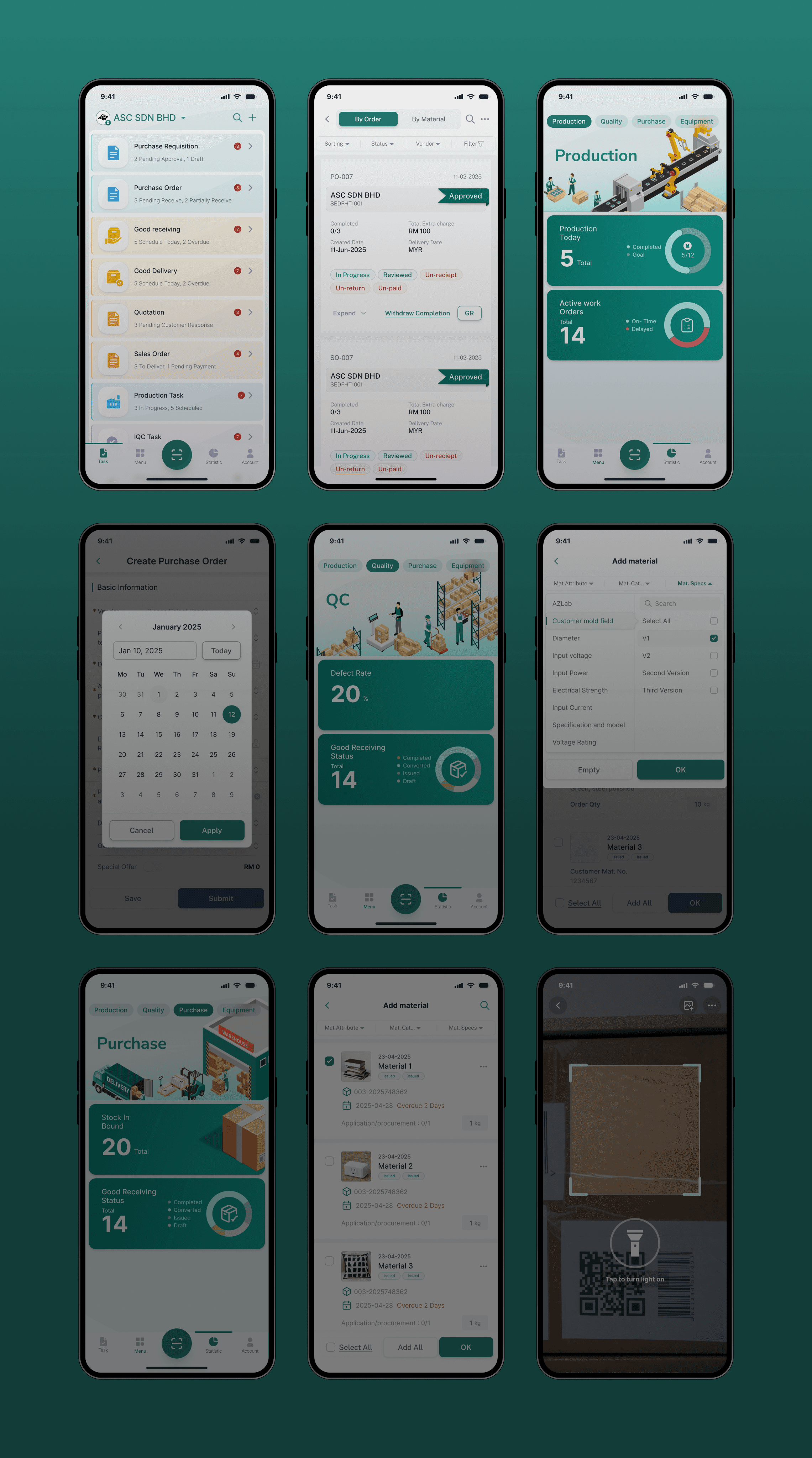
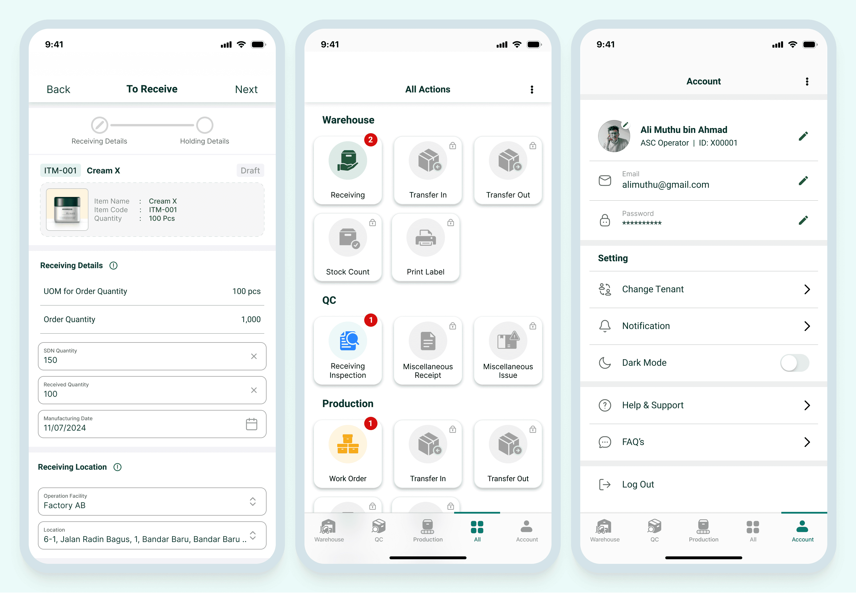
By version 3, we realized the app was growing more complex, and so were our users' needs. Our previous designs, though improved, were starting to feel cluttered and too playful for an enterprise tool. It was time for a professional overhaul.
We completely restructured the navigation. Instead of feature-driven tabs, we shifted to a task-based model:
Task, Menu, Scan (central), Statistic, Account
This made the app feel more like a dashboard for daily work instead of a list of tools.
We redesigned input forms to be more intuitive, with clearer hierarchy, field grouping, and fewer distractions. Users were often entering detailed info — so we prioritized readability, focus, and flow. Think of it like clearing a messy desk to help someone concentrate better.
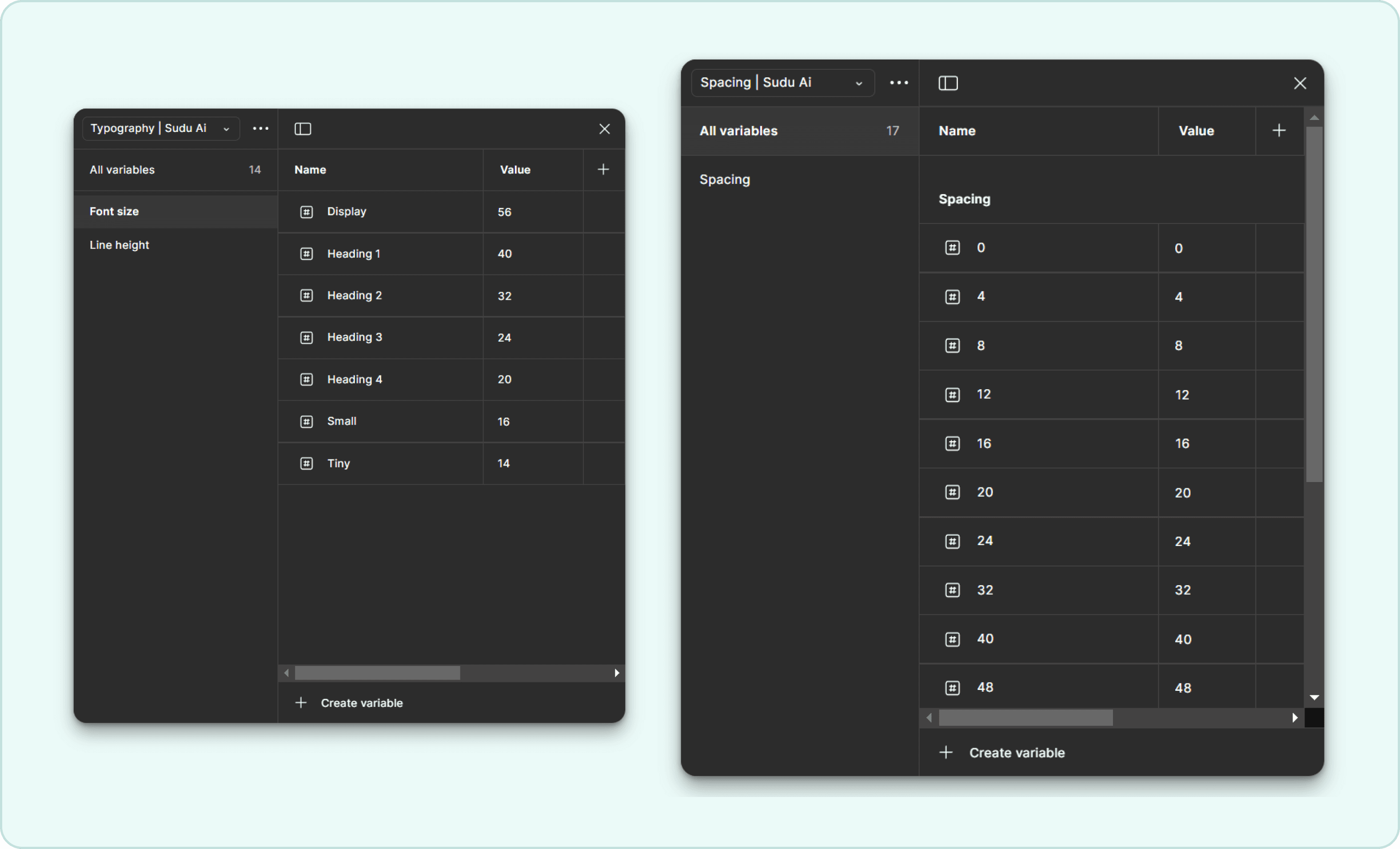
We also began building our design system — a library of consistent components, from dropdowns and modals to buttons and icons. This ensured our web and mobile platforms stayed in sync, reduced design debt, and made collaboration with developers smoother and faster.
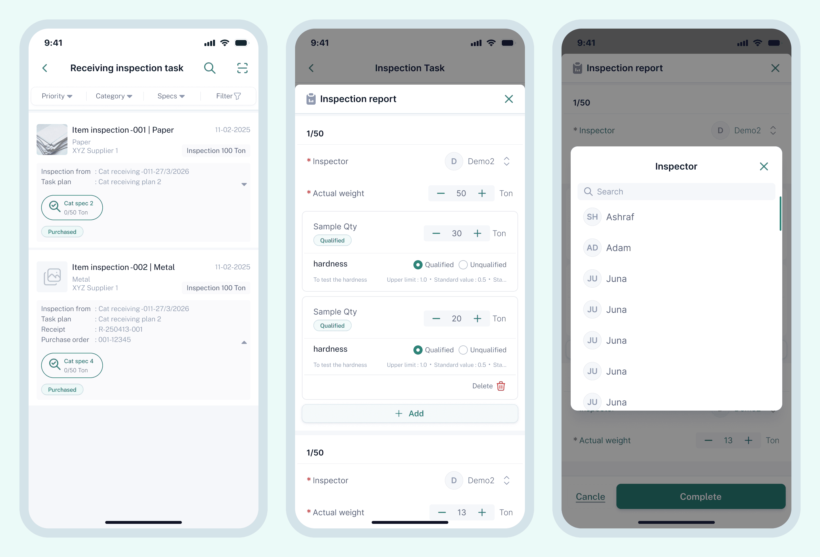
A key improvement was the enhanced Scan feature — now treated as a core function with a standard, robust design, instead of a quick add-on. We introduced multi-tab sections within key pages, improving information organization and reducing cognitive overload.
We also removed unnecessary illustrations, improved spacing, and focused on visual consistency, giving the product a clean, industrial-standard feel — exactly what a professional ERP tool needed.
I took a hands-on role to fix these issues. First, I reviewed the entire UI to spot any mismatches between the design guide and the live product. I also checked the developers' code styling during testing to ensure consistency and quality. Then, I created a detailed, easy-to-follow guide for the developers, explaining our style rules with clear instructions and visual examples.
For every new design update, I also produced a detailed development UI guideline. This document includes visual examples, step-by-step instructions and wireframe, and best practices to maintain our design vision. These clear, actionable guidelines empower the development team.
Designing the mobile ERP system reminded me that great UX isn't just about beauty — it's about clarity, intention, and real-world empathy. By taking a step-by-step approach, working closely with cross-functional teams, and staying curious, we transformed a functional prototype into a scalable, professional product that users actually enjoyed using.